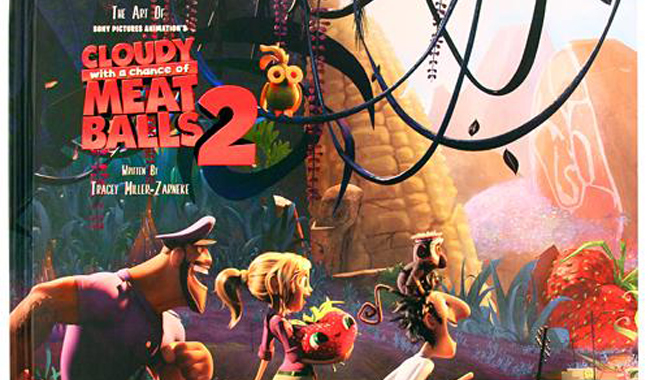
The Art Of Cloudy With A Chance Of Meatballs 2 review
 TMZ also authored the Hotel Transylvania Art of Book that we reviewed fairly highly here.
The fold out hard over reveals a set of colour keys across three paves, which is a pretty impressive first impression. Anyone who has seen the film knows it’s an explosion of colours so it’s no surprise that the Art of is similarly sensory overload.
The character design section is a little sparse with it’s human characters. Move onto production design though and you’ll see why. There are pages of city layouts that finally give way to the Island. Saying that though, don’t skip it. The San Franjose double page layout is a beautiful example of a warm city colour palette. But it’s at the pages that details Swallow Falls that the book really comes into it’s own. The environments are so imaginative and lush, you can really tell they just had a great time creating these new worlds based around recognizable foodstuffs. Pagers and pages of foodimals are the real highlight and a lo tof fun to decipher and if you’ve seen the film, you’ll be glad to know that the Tomato gag is repeated.
For me though, there were too many finally rendered images. Inclusions of sketches from Pete Oswald were lovely, but far too few. Other pages like Big Rock Candy Mountain too up a whole page but lacked charm. Having seen the film, I was expecting a book full of finished and intricate images from the film, which isn’t what you want from an art of book – what you really want are the sketches and paintings from way before they’ve come up with anything concrete. This falls somewhere in the middle and that for me is an issues.
Of course it’s beautiful, of course you’re going to want to flip through it, but it’s not one of the more inspiring Art of books around. A fascinating glimpse as always, which lacked depth for me – but depending on what you’re looking for it may just be perfect.
Maliha Basak
